
Appearance
Guest Analytics
Understand your venue's WiFi guest data with CaptiFi's analytics.
Overview
CaptiFi captures detailed analytics every time a guest connects to your WiFi. Analytics live in four places on the dashboard:
| Page | What it's for |
|---|---|
| Dashboard (home) | At-a-glance KPIs and trend charts |
| My Venues → Analytics | Deeper analysis: busiest hours, device breakdowns, venue comparisons, footfall heatmap |
| My Venues → Guest Visits | The full guest log: search, filter, export, GDPR tools |
| My Venues → Reports | Branded weekly and monthly PDF summaries to download or email |
Guest analytics are included on every plan from Essentials up: visits, unique guests, opt-ins, the guests trend chart and your sign-up funnel. Analytics are not on Lite. The Lite home page shows the contacts you have collected, your marketing opt-ins and your new guests this month, and Guest Visits keeps its CSV export.
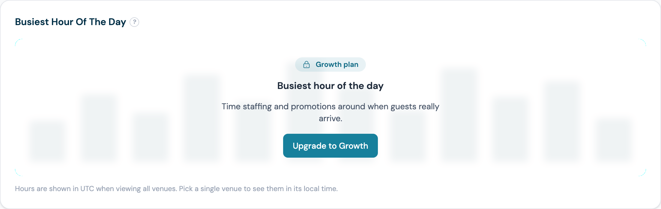
The deeper reports (busiest hour of the day, device and platform mix, dwell time, the footfall heatmap, popular access points and return-visit gaps) are Advanced analytics, included on Growth and above. Comparing venues side by side (the Top Venues table and the all-venues view) is on Pro and above; below Pro the dashboard shows one venue at a time, chosen with the venue picker.
Where a report is not on your plan, the card explains what it shows and offers the upgrade rather than simply hiding:
The page also carries one prompt at the top listing exactly what unlocks:

Dashboard KPIs
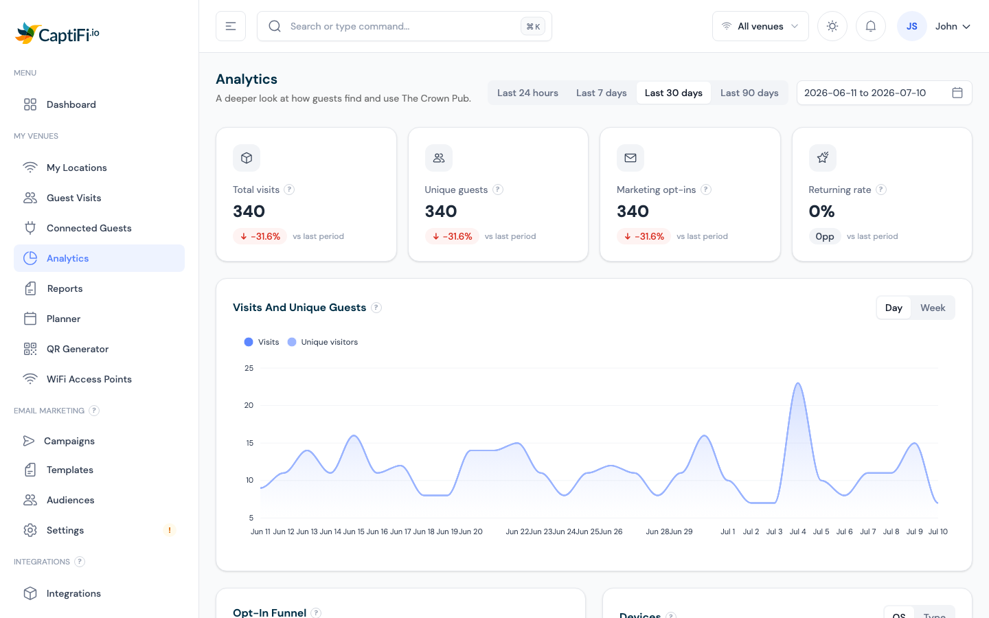
The home screen (and the Analytics page) shows KPI cards for the selected date range:
| Card | What It Shows |
|---|---|
| Total visits | All WiFi logins in the period |
| Unique guests | Distinct people (each counted once, however many times they connect) |
| Marketing opt-ins | Guests who consented to marketing, counted once each |
| Returning rate | Share of unique guests who have visited before |
| Avg dwell time (Analytics page) | How long guests stay connected on an average visit, from live session tracking |
| Connected now | Guests online right now (updates every 60 seconds), click through to Connected Guests |
Use the date range picker (top right) and the venue switcher (top bar) to change what you're looking at. Click any KPI card to drill through to its detail page.
How CaptiFi decides two visits are the same guest
Anything that counts people rather than connections (unique guests, returning rate, marketing opt-ins, new vs returning, top venues and access points) recognises a returning guest by, in order:
- Their email address, ignoring capitals and spaces.
- Their mobile number, when your splash page collects a phone instead of an email.
- Their device, when the form collects neither.
So a phone-capture splash page counts people just as accurately as an email-capture one, and a guest who connects five times in a day is one unique guest and five visits.
Charts
Visits and Unique Guests: trend over time, with a day/week granularity toggle
New vs Returning: retention at a glance
Opt-In Funnel: how many guests connect, complete the form, and opt in
Devices / Device Mix: phone vs tablet vs laptop, and operating systems
Busiest Hour of the Day (Analytics page): when your venue is busiest
Top Venues (Analytics page, multi-venue): compare locations side by side
Popular Access Points (Analytics page): where guests connect inside your venue, ranked by visits, with each access point's average dwell time when session tracking is available. Rename your access points (for example "Front Entrance", "Garden") on the Access Points page and this reads like zone analytics
Peak occupancy (Analytics page): the most guests online at once in the period, when that busiest moment happened (shown in your venue's local time), a day-by-day sparkline of peaks, and the change versus the previous period
Avg return gap (Analytics page): how many days the average guest waits between visits, with the change versus the previous period. The Set up win-back email button opens the campaign builder with a timing tip based on your venue's own number
Visit Duration (Analytics page): how long guests stay connected, bucketed from under 5 minutes to 2 hours plus, with last period's most common length for comparison
Guest roaming (Analytics page): the share of guests who move between access points during a visit, how many zone changes they average, and the change versus the previous period
Venue Map (Analytics page): upload a floor plan of your venue, place your access points on it, and see heat zones showing where guests connect. See Venue Map below
Footfall heatmap (Analytics page): visit intensity by day and hour
Click any row in Popular Access Points to enter zone view: the trend, busiest hour, footfall, peak occupancy, and visit duration charts filter to that access point, with a banner showing which zone you are viewing (click again or use Clear zone to exit). When a single venue is selected, the Busiest Hour and Footfall charts show times in that venue's local timezone. Viewing all venues together falls back to UTC (there is no single timezone to use). The Popular Access Points ranking has an Export CSV button for the selected date range.
Venue Map
Turn your floor plan into a heat map of guest activity:
- On the Analytics page, select a venue (single-venue accounts skip this step) and find the Venue Map card
- Click Upload floor plan and choose an image of your layout (a photo of a printed plan works fine; JPG, PNG or WebP up to 5 MB)
- Click Edit map, click an access point chip, then click its position on the plan. Drag pins to fine-tune; use a pin's x to take it off the map
- Click Done editing. The map now shows a heat blob per access point, sized by its share of guest visits in the selected date range. Hover a pin for visits and average dwell time
Heat zones reflect which access point each guest connected through, so they show activity by area, not exact guest positions. Pins also carry a green badge with the number of guests online at that access point right now (refreshes every minute). Removing the floor plan clears all pins.
Your modules
Below the charts and the venue map, Your modules shows a card for each module your account has switched on, for the same date range and venue selection as the rest of the page. Nothing appears for a module that is off.
- Ticket sales (Events and tickets on): paid orders (fully refunded orders are not counted), tickets sold on those orders, RSVPs and check-ins, a table per currency of face value, booking fee, refunds and net to venue, and your top events for the period. The money figures come from the same source as Events → Reports, so the two always agree
- WiFi vouchers (WiFi Vouchers on): codes generated, redeemed and active now, with a row per venue showing how many were made on the WiFi Vouchers page, how many a till printed, and how many of the redeemed codes came from a till
- Rewards (a live programme): members joined, rewards issued and redeemed and points earned, following the venue you have selected, with completed redemptions by venue and currency
- Paid WiFi (a venue on paid access): sessions, the number active now, and revenue per currency and per venue
Money is shown per currency and never added across currencies. A per-venue table shows up to ten venues, with a line under it saying how many more there are. Each card's Open link goes to the module's own page for the full picture.
Guest Visits (the Full Log)
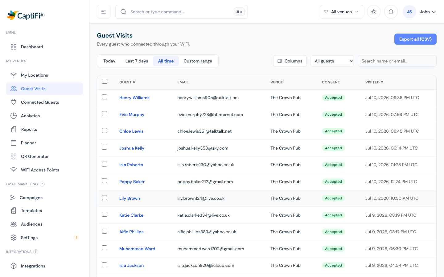
Go to My Venues → Guest Visits:
- Every arrival is a row, the list is a live feed: the newest arrival sits at the top, and a guest who comes back gets a row for that visit as well. The Visit column badges each row New (their first sign-up) or Returning (they have been before). Imported contacts show a dash, because they have never visited
- Tabs: Today, Last 7 days, All time, or a custom date range
- Search: by name or email
- Filters, visit type (all arrivals, new sign-ups only, or returning visits only), subscribed / not subscribed to marketing, and where the contact came from (your WiFi, or an imported list)
- Columns: the table automatically matches your splash page form: custom questions (a phone number, for example) get their own column, and the Email column only appears when at least one of your venues collects email. Use the Columns menu to override any of it; your choices are remembered.
- Last visited and Visits, the Last visited column moves every time a guest comes back (returning guests are recognised automatically and skip the sign-in form), and the Visits badge shows their running total. A guest showing 1 visit is new; a green badge means a regular. Imported contacts show a dash here because they have never visited
- Bounced emails, any address that could not receive mail is marked with a red Bounced badge, so fake or dead emails stand out at a glance. CaptiFi stops emailing these addresses automatically, and they can never be used on a splash page again
- Export all (CSV): download the complete log for the selected venue, including a column for every custom splash question plus an Email Status column (ok or bounced), handy for cleaning lists you keep in your own CRM. The export is one row per guest even when they have visited many times, so an address is never repeated in a list you feed to your own tools
- Click a guest, their full profile: visits and rhythm, spend at the till when Toast or Square is connected, marketing reachability, reviews, bookings, your private notes and tags, plain-English prompts for your team, and the buttons to kick or block their device (below). See The Guest Profile. Tags can be added by hand there, or automatically by a Planner "Tag guests" automation, and either way you can use them to build an audience segment later
- Bulk GDPR actions: anonymise or delete selected guests (see Account Settings)
- Import contacts, upload a contact list you already have (see Import Existing Contacts). Imported contacts appear here marked Imported and are excluded from the visit metrics below, because they never visited
Kick or Block a Guest Device from Their Profile
If one guest is causing a problem, you can act on their device without hunting for them in the live list:
- Go to My Venues → Guest Visits
- Search for the guest, then click their name to open their profile
- At the top right of the profile, choose:
- Kick off WiFi, the device is disconnected straight away. The guest can sign in again through your splash page whenever they like
- Block device, the device is disconnected and refused every time it tries to join that venue again, until you unblock it
- Confirm in the dialog that appears
CaptiFi then checks with your WiFi hardware that the device really has gone, rather than taking the command's acknowledgement on trust. On UniFi it reads the client back from your controller; on CaptiFi access points it reads the access point's list of authorised devices. The result appears in the notice that follows:
- A green Device kicked or Device blocked notice means the check confirmed it: your network no longer lists the device as authorised (and, for a block on a UniFi controller, reports it as blocked)
- An amber notice means the command was accepted but the check could not confirm it yet. The notice says why: the device still showed as authorised at the time of the check, or your controller or access point could not be read. Try again in a moment, and check Connected Guests if the device stays online
- A red notice means the command itself failed, for example because CaptiFi could not sign in to your controller. Nothing has changed for the guest
A kicked guest stays kicked even if the check could not confirm it straight away; the check only tells you what your network reported at that moment.
A blocked guest's profile shows an Unblock device button instead, so you can lift the block at any time.
The buttons only appear when CaptiFi has a current connection for that guest's device and your WiFi hardware supports the action (UniFi controllers and CaptiFi access points do).
Block device needs a direct connection to your UniFi controller. If your UniFi site is linked through the UniFi cloud (Site Manager) account instead of a local controller API key, Kick off WiFi works but Block device reports that blocking is not supported: the UniFi cloud API has no block command. Reconnect the site with a local controller API key to block devices.
Who can do this
Team members need the Manage devices permission, the same permission the block action needs on Connected Guests. See Team Members.
Weekly and monthly reports
My Venues → Reports generates a branded PDF summary of how your venue performed over a week or a month. Download it, email it straight to stakeholders, or have it emailed every week, month or quarter (see Email reports automatically). Accounts with a live Rewards programme get a Rewards section too: members joined, points earned, redeemed and expired, and redemptions per venue in each venue's own currency; see Rewards in your monthly report. The report also carries a sheet for each other module you have switched on, Ticket sales, WiFi vouchers and Paid WiFi, with the same per-currency tables as the cards under Your modules on the Analytics page. A monthly report covers the calendar month and compares it with the month before. A weekly report covers Monday to Sunday, UK time, and compares it with the week before. The live "active now" counts stay on the dashboard and are not printed.
To make a report, go to Generate a report, choose Monthly report or Weekly report under Report, pick the venue (on an account with several venues) and a month or week that has finished, then choose Generate report. The week list offers the last 12 weeks that have ended. Reports appear under Your reports, newest first, where weekly ones show as Weekly report with their dates.
Email reports automatically
The Email reports automatically card on the Reports page sends the report by email to up to five people, such as a manager or your accountant. Each venue has its own list, so on an account with several venues choose the venue in the card first.
- Turn on the switch. The list starts with your own address, which you can change.
- Enter an email address and choose how often that person gets the report. Weekly sends the report for the week just ended, Monday to Sunday, every Monday morning. Monthly sends each month's report on the 1st of the next month, once the report has been generated that morning. Quarterly sends one email on 1 January, 1 April, 1 July and 1 October with the three monthly reports of the quarter just ended, one PDF per month.
- Use Add a person for more addresses, up to five, then choose Save.
Under each saved address the card shows when the last report email went to it, or why it was not sent, for example an address that has bounced before. The card also shows when the next emails go out.
Turning the switch off and saving stops the emails and keeps the list, so you can turn them back on later without typing the addresses again.
Every report email has a Stop these emails link at the bottom. It takes that address off the venue's list, and the card then shows it under Stopped by the recipient with the date. An address that stopped the emails this way cannot be added back from the card. The person can undo it from the same page for 30 days; after that, contact support to add them back. Nobody who was taken off the list by the venue can use an old email to add themselves again.
A report email is not sent to an address that has bounced or that marked a CaptiFi email as spam, and the line under that address says so.
Reports and report emails are on Growth and above. A team member needs the Export data permission to see or change the list, the same permission as for downloading or emailing a report.
Key Metrics to Track
| Metric | What to Look For |
|---|---|
| Visits | Is footfall growing week on week? Unexpected dips? |
| New vs returning | Are you attracting new guests, retaining existing ones, or both? |
| Busiest hours | Use for staffing and promotion timing |
| Opt-in rate | Below ~30% suggests your splash page copy needs work |
| AP health | Offline access points mean missed data |
Using Analytics for Business Decisions
| Insight | Action |
|---|---|
| Tuesday afternoons are quiet | Run a targeted email campaign with a Tuesday-only offer |
| Opt-in rate dropped this month | Review your splash page welcome message and consent copy |
| High new guests but low return rate | Set up a welcome automation with a return-visit incentive |
| One venue outperforming others | Compare splash designs and campaigns across your venues |
For benchmarks and frameworks, see WiFi Analytics for Business.
Related Features
- AI Assistant: ask questions about your guest data in plain English
- Connected Guests: the live view
- Email Campaigns: act on your insights
- Multi-Venue Management: compare locations