
Appearance
Guest Analytics
Understand your venue's WiFi guest data with CaptiFi's analytics.
Overview
CaptiFi captures detailed analytics every time a guest connects to your WiFi. Analytics live in four places on the dashboard:
| Page | What it's for |
|---|---|
| Dashboard (home) | At-a-glance KPIs and trend charts |
| My Venues → Analytics | Deeper analysis: busiest hours, device breakdowns, venue comparisons, footfall heatmap |
| My Venues → Guest Visits | The full guest log: search, filter, export, GDPR tools |
| My Venues → Reports | Branded monthly PDF summaries to download or email |
Guest analytics are included on all plans: visits, unique guests, opt-ins, the guests trend chart and your sign-up funnel.
The deeper reports (busiest hour of the day, device and platform mix, dwell time, the footfall heatmap, popular access points and return-visit gaps) are Advanced analytics, included on Growth and above. Comparing venues side by side (the Top Venues table and the all-venues view) is on Pro and above; below Pro the dashboard shows one venue at a time, chosen with the venue picker.
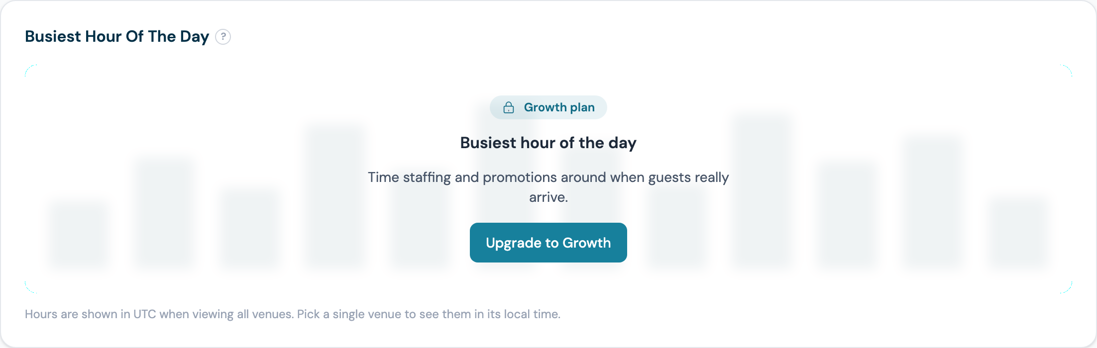
Where a report is not on your plan, the card explains what it shows and offers the upgrade rather than simply hiding:
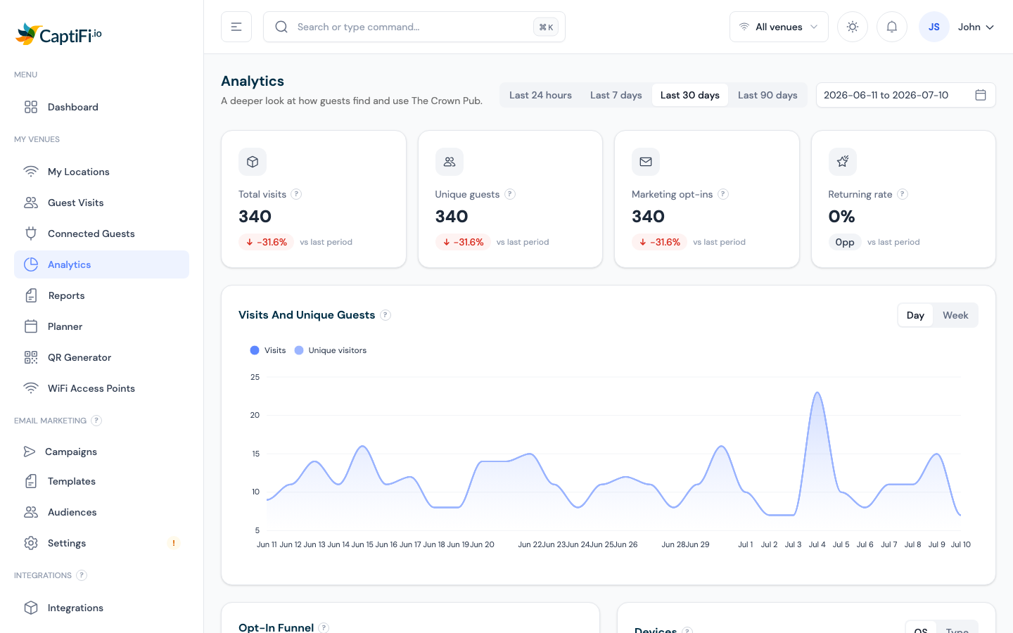
The page also carries one prompt at the top listing exactly what unlocks:

Dashboard KPIs
The home screen (and the Analytics page) shows KPI cards for the selected date range:
| Card | What It Shows |
|---|---|
| Total visits | All WiFi logins in the period |
| Unique guests | Distinct guests (each counted once) |
| Marketing opt-ins | Guests who consented to marketing |
| Returning rate | Share of guests who have visited before |
| Avg dwell time (Analytics page) | How long guests stay connected on an average visit, from live session tracking |
| Connected now | Guests online right now (updates every 60 seconds) — click through to Connected Guests |
Use the date range picker (top right) and the venue switcher (top bar) to change what you're looking at. Click any KPI card to drill through to its detail page.
Charts
Visits and Unique Guests — trend over time, with a day/week granularity toggle
New vs Returning — retention at a glance
Opt-In Funnel — how many guests connect, complete the form, and opt in
Devices / Device Mix — phone vs tablet vs laptop, and operating systems
Busiest Hour of the Day (Analytics page) — when your venue is busiest
Top Venues (Analytics page, multi-venue) — compare locations side by side
Popular Access Points (Analytics page) — where guests connect inside your venue, ranked by visits, with each access point's average dwell time when session tracking is available. Rename your access points (for example "Front Entrance", "Garden") on the Access Points page and this reads like zone analytics
Peak occupancy (Analytics page) — the most guests online at once in the period, when that busiest moment happened (shown in your venue's local time), a day-by-day sparkline of peaks, and the change versus the previous period
Avg return gap (Analytics page) — how many days the average guest waits between visits, with the change versus the previous period. The Set up win-back email button opens the campaign builder with a timing tip based on your venue's own number
Visit Duration (Analytics page) — how long guests stay connected, bucketed from under 5 minutes to 2 hours plus, with last period's most common length for comparison
Guest roaming (Analytics page) — the share of guests who move between access points during a visit, how many zone changes they average, and the change versus the previous period
Venue Map (Analytics page) — upload a floor plan of your venue, place your access points on it, and see heat zones showing where guests connect. See Venue Map below
Footfall heatmap (Analytics page) — visit intensity by day and hour
Click any row in Popular Access Points to enter zone view: the trend, busiest hour, footfall, peak occupancy, and visit duration charts filter to that access point, with a banner showing which zone you are viewing (click again or use Clear zone to exit). When a single venue is selected, the Busiest Hour and Footfall charts show times in that venue's local timezone. Viewing all venues together falls back to UTC (there is no single timezone to use). The Popular Access Points ranking has an Export CSV button for the selected date range.
Venue Map
Turn your floor plan into a heat map of guest activity:
- On the Analytics page, select a venue (single-venue accounts skip this step) and find the Venue Map card
- Click Upload floor plan and choose an image of your layout (a photo of a printed plan works fine; JPG, PNG or WebP up to 5 MB)
- Click Edit map, click an access point chip, then click its position on the plan. Drag pins to fine-tune; use a pin's x to take it off the map
- Click Done editing. The map now shows a heat blob per access point, sized by its share of guest visits in the selected date range. Hover a pin for visits and average dwell time
Heat zones reflect which access point each guest connected through, so they show activity by area, not exact guest positions. Pins also carry a green badge with the number of guests online at that access point right now (refreshes every minute). Removing the floor plan clears all pins.
Guest Visits (the Full Log)
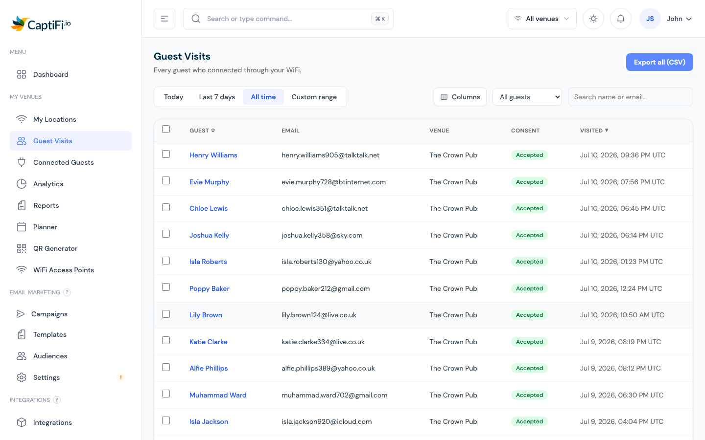
Go to My Venues → Guest Visits:
- Tabs — Today, Last 7 days, All time, or a custom date range
- Search — by name or email
- Filters, subscribed / not subscribed to marketing, and where the contact came from (your WiFi, or an imported list)
- Columns — the table automatically matches your splash page form: custom questions (a phone number, for example) get their own column, and the Email column only appears when at least one of your venues collects email. Use the Columns menu to override any of it; your choices are remembered.
- Last visited and Visits, the Last visited column moves every time a guest comes back (returning guests are recognised automatically and skip the sign-in form), and the Visits badge shows their running total. A guest showing 1 visit is new; a green badge means a regular. Imported contacts show a dash here because they have never visited
- Bounced emails, any address that could not receive mail is marked with a red Bounced badge (a warning icon on the classic dashboard), so fake or dead emails stand out at a glance. CaptiFi stops emailing these addresses automatically, and they can never be used on a splash page again
- Export all (CSV) — download the complete log for the selected venue, including a column for every custom splash question plus an Email Status column (ok or bounced), handy for cleaning lists you keep in your own CRM
- Click a guest, full profile with every visit listed, plus your own private notes and tags
- Bulk GDPR actions — anonymise or delete selected guests (see Account Settings)
- Import contacts, upload a contact list you already have (see Import Existing Contacts). Imported contacts appear here marked Imported and are excluded from the visit metrics below, because they never visited
Monthly Reports
My Venues → Reports generates a branded PDF summary of how your venue performed each month — download it, or email it straight to stakeholders.
Key Metrics to Track
| Metric | What to Look For |
|---|---|
| Visits | Is footfall growing week on week? Unexpected dips? |
| New vs returning | Are you attracting new guests, retaining existing ones, or both? |
| Busiest hours | Use for staffing and promotion timing |
| Opt-in rate | Below ~30% suggests your splash page copy needs work |
| AP health | Offline access points mean missed data |
Using Analytics for Business Decisions
| Insight | Action |
|---|---|
| Tuesday afternoons are quiet | Run a targeted email campaign with a Tuesday-only offer |
| Opt-in rate dropped this month | Review your splash page welcome message and consent copy |
| High new guests but low return rate | Set up a welcome automation with a return-visit incentive |
| One venue outperforming others | Compare splash designs and campaigns across your venues |
For benchmarks and frameworks, see WiFi Analytics for Business.
Related Features
- AI Assistant — ask questions about your guest data in plain English
- Connected Guests — the live view
- Email Campaigns — act on your insights
- Multi-Venue Management — compare locations